We recently helped our friends at Lawyers Mutual of North Carolina dramatically improve the performance of their blog content from a number of different metrics. Their blog is one of the primary drivers of visitors to the site, so any changes to better serve those visitors and make them more engaged can pay real dividends for the business in new leads and clients. Below we'll look at some of the changes put in place, lessons learned, and the ultimate results -- these tips could be helpful to put into practice for any business that leverages their blog or thought leadership to build their business. And best of all, they're easy to implement!
Background
NMC has worked with Lawyers Mutual of North Carolina on their website and online marketing strategy since 2012 and they've long been one of our favorite legal clients! The team at Lawyers Mutual is always looking to improve their site, giving us the opportunity to continually experiment with new features and functionalities to try and increase engagement on the site and maximize it as an education and sales tool for the business.
Lawyers Mutual does a wonderful job of writing and sharing valuable content for the lawyers that make up their audience (a useful strategy for law firm websites). While no single post represents a huge portion of their site traffic, the blog section drives more than a third of their total site traffic. Therefore, it's a very important area of their website.
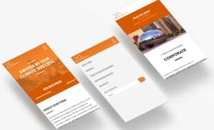
Last year, they launched a new blog design to turn the section into more of a content portal. In this redesign, each blog post included:
- A large subscribe button at the top of the sidebar
- Organization into one of four primary content types with filters for each of those content types
- Sub-categories that defined what related posts would show in the sidebar
- A banner image to make the content more visually appealing when the page first loaded
- Comments to allow for audience participation
While all of those ideas seemed like good ones at the time, as we continued to monitor the blog post performance after the portal update launched, the results were not what we were hoping for – visitors were actually spending less time reading the blog posts and weren't using any of the content filters or exploring the related content.
So, we went back to the drawing board.
The overall goal of the blog is to provide relevant information to visitors, most of whom are organic search referrals, and then deeply engage them with the content. While our previous experiment didn't turn out the way we had hoped, it did tell us that visitors were there to read the posts and weren't as interested in all the other options that potentially distracted from the core post.
We developed a new plan to redesign the blog post layout with a much more minimal design approach, focused squarely on the blog content with fewer, but more intentional, calls to action for the readers.
Focusing on the content
When visitors landed on the new blog post layout, we wanted to present them with the content they expected with as few distractions as possible. We made three significant changes to accommodate that goal:
- Removed the sidebar altogether and made the content full width
- Removed the banner image on each post so the content stands out as soon as the page loads
- Removed the content bucket filters so visitors aren't distracted from the content they're expecting to see

Strategically placed calls to action
The new blog design needed to do a better job of providing ways for visitors to find more content, share content and learn how to stay in touch with Lawyers Mutual at a time that made sense. The previous blog post layout provided that information while visitors were scrolling through and reading the content of the post they were viewing. The new layout, however:
- Shows related content at the bottom of the post so visitors can focus on the content of the post they're on and when they're finished, can easily access other information that they might be interested in
- Requests that visitors subscribe to the blog after they've read the post and not right when they land on the post
- Allows Lawyers Mutual to highlight specific quotes within the blog post content and those quotes are easily tweetable, making the content much simpler for visitors to share

The Results
After implementing the changes, there was nearly an across-the-board increase in visitor time spent on the blog post pages, which was super exciting to see! Here are a few highlights:
- Visitors are spending an average of 10% more time on the blog posts
- Organic search visitors are spending 33% more time on the posts
- Each of their 5 most popular blog posts saw a dramatic increase in time spent on the post
The bounce rate stayed pretty consistent when comparing the previous layout with the new one, so that's one area we will look to improve moving forward. The biggest takeaways from our blog design and redesign are: 1) always be intentional with your design decisions and 2) make sure you test your hypotheses and react if they don't come to fruition!


Comments
Peter
Great job, the updated page looks good. The Tweet option is a great thing to have, but I'm wondering, did people use them, and how much? Thanks!Leave a comment