
2017 Web Design Trends
Update: Check out our post on web design trends for 2018 here. Read on, though, if you want to see what was hip, last year!
Happy 2017! Each year we like to take some time to figure out the upcoming trends in web design. Not only does it give us a chance to research all the cool things other folks are doing, but it also gives us the opportunity to look through our own work and see what sort of patterns are emerging. We did a lot of cool work in 2016, but we want to stay ahead of the curve and make sure our work is always using the most modern and effective tactics.
Here’s what we anticipate seeing a lot of in 2017:
Forget the grid
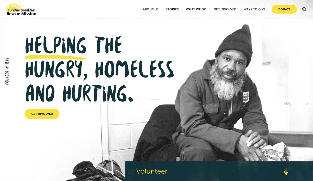
At least in the traditional, 12-column, fixed width sense. Think lots of layered elements, text or navigation placed vertically along the side, or floated images and text compositions that truly make use of desktop space. We’ve been seeing elements “break the grid” on a lot of sites the last couple years - especially on agency or other creative industry sites, but I think we’ll start to see this creep more into corporate websites this year.
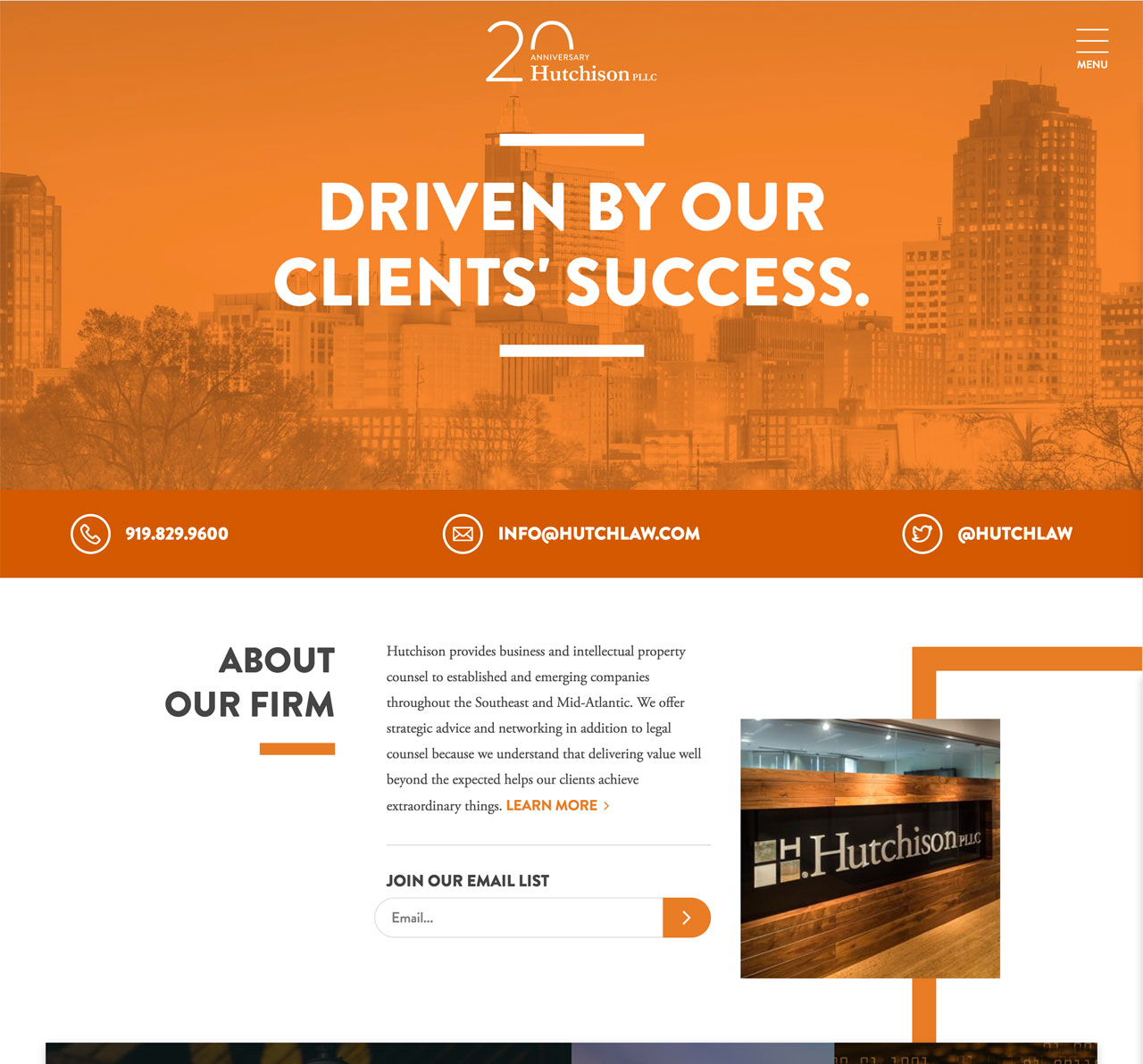

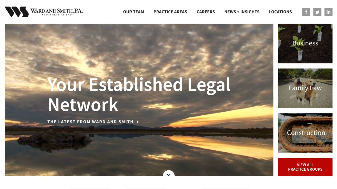
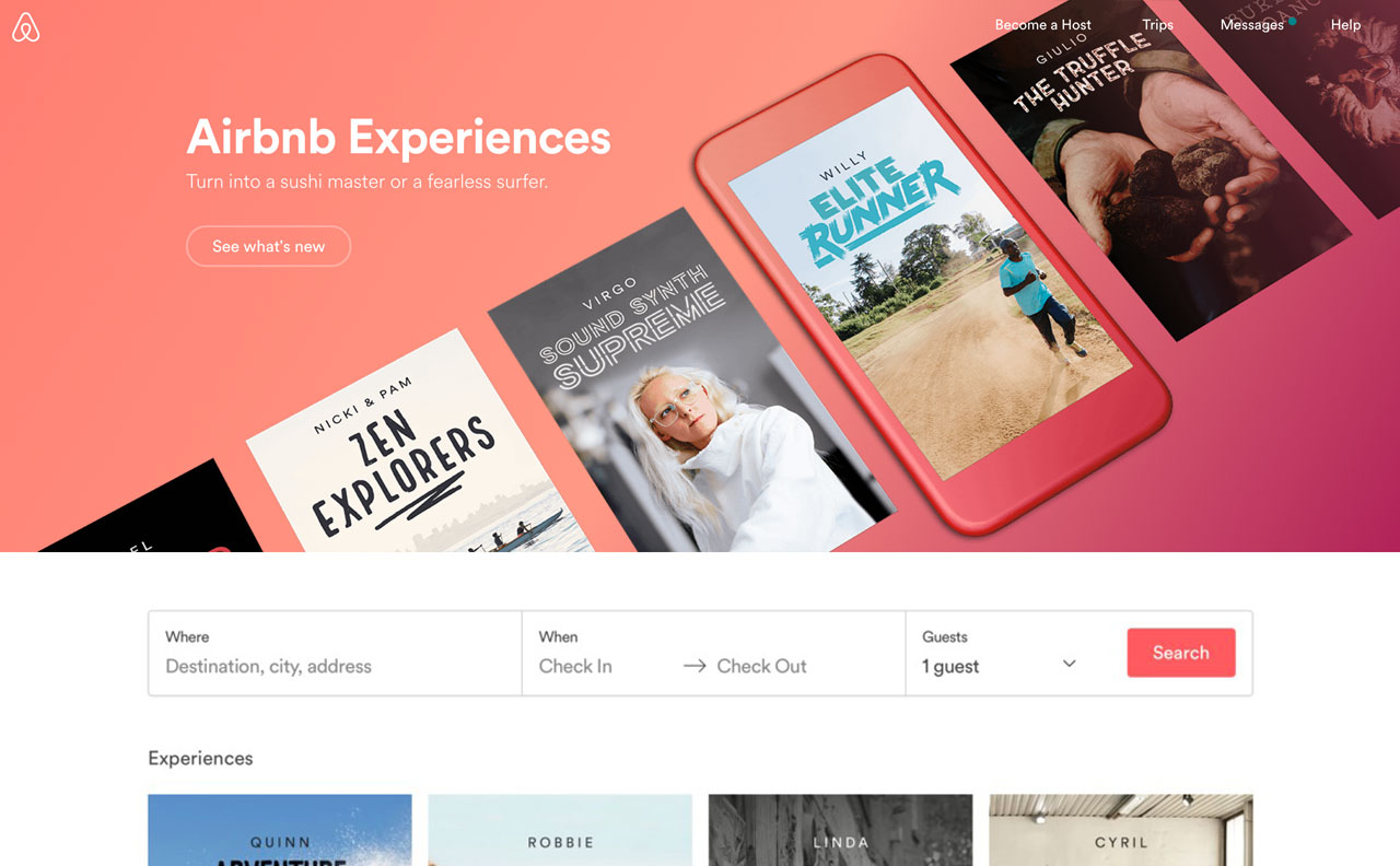
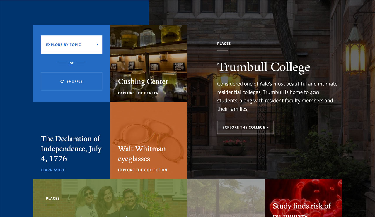
Multi-faceted Feature Areas
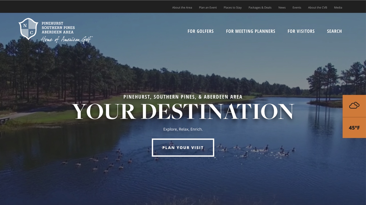
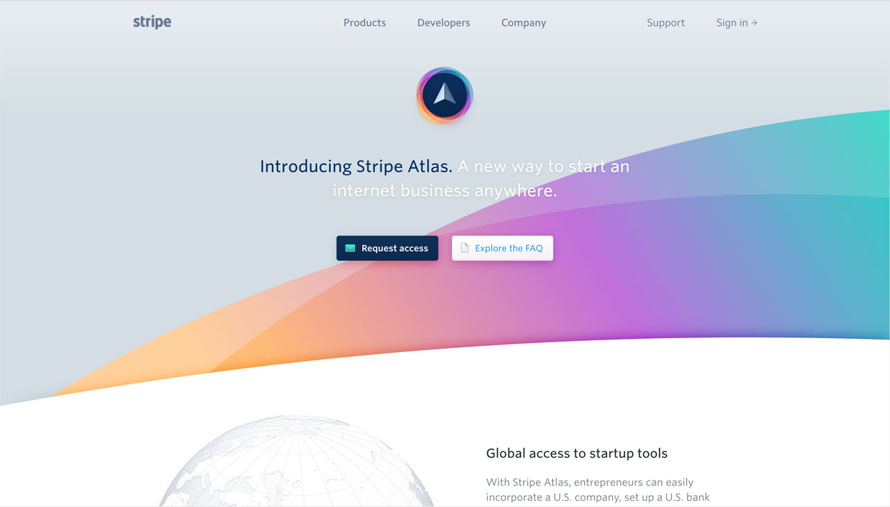
Long gone are the days where an image slider came standard at the top of every website homepage. It seems that people have finally started to realize carousels on the homepage don’t keep user attention, and are finally moving away from them. In the wake of that, we should start to see more unique ways to layout multiple sets of content at the top of the homepage - whether it’s partially hiding content cards, or a grid layout.
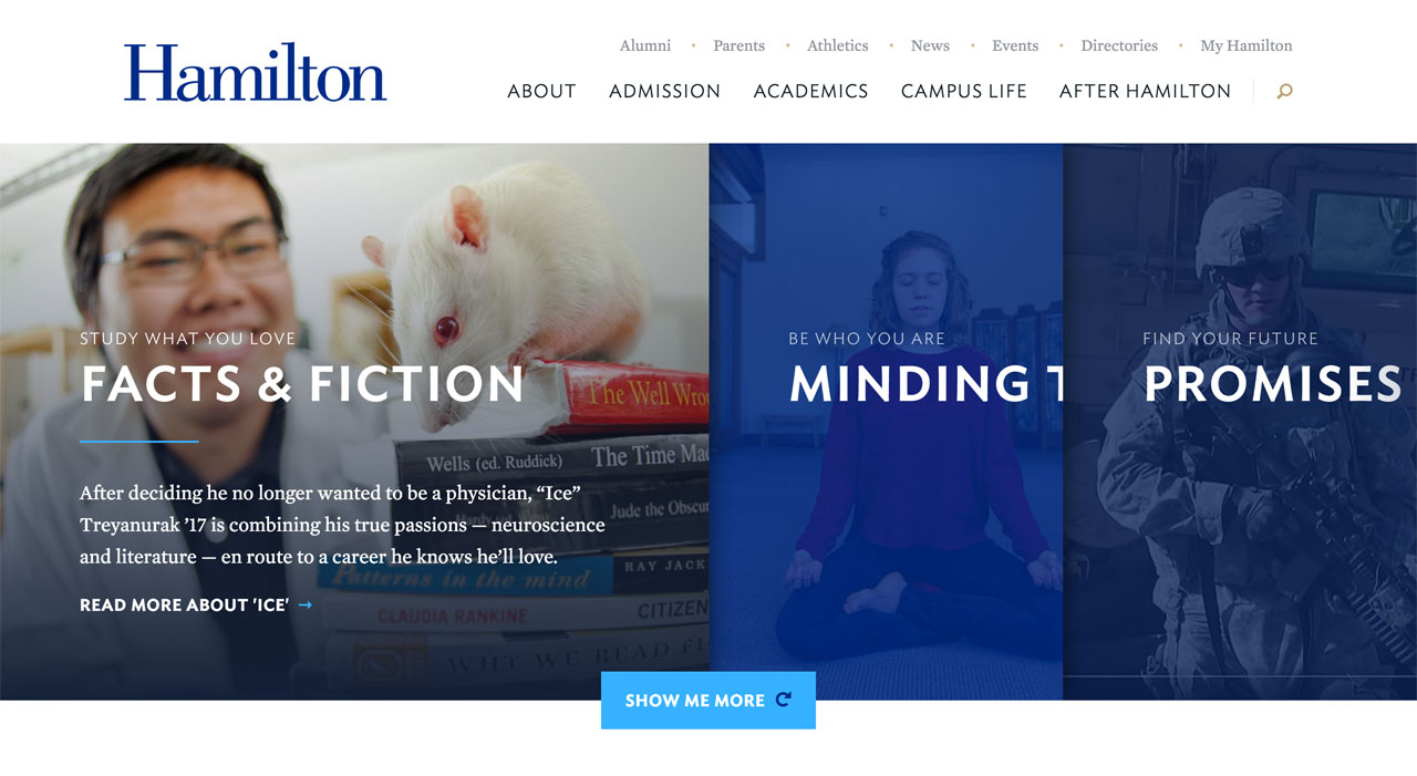
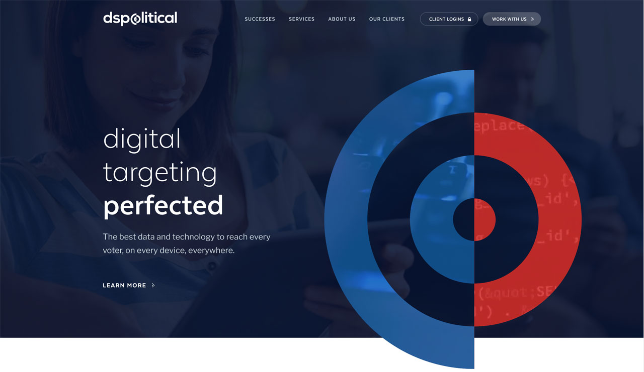
Vertical Split Layouts
We’ve already seen a lot of sites that encompass a split vertical layout on the homepage - usually to help portray two different sets of content with contrasting colors or images. With the death of the homepage carousel, I think we can expect to see even more layouts like this in 2017.

Ambient Video
We actually called this one back in 2015. However, as more storytelling moves to video we can expect to see this pop up even more in banner areas and within content.
SVG Masking in Full Swing
Creating a unique shape or edge within a webdesign has never been easier thanks to SVG masking. In 2017 we can expect to see more angled and curved edges, along with shapes woven into layouts.
Subtle Animation
Spend five minutes looking at design work on Dribbble and you’ll see animation is getting heavily integrated with design. This year, we can expect to see subtle animations added into a majority of sites especially to elements that were once static like icons and numbers call-outs, and effects to sections as the user scrolls down.

The Return of Texture and Tactile Details
With the rise of flat UI, everything on the web looked super Bootstrap for awhile. In an effort to stand out more, I think we’ll start seeing more designs bring back in texture. We’ve personally been loving Hero Patterns, a free gallery of SVG patterns. We’ll also start to see more tactile elements getting added to designs - such as paint and ink textures, paper edges, and hand-drawn elements.
Gradient Love
No, not the exaggerated gradients we were used to seeing in the skeuomorphic design era. Think subtle gradients in monochromatic palettes that just add a little depth and punch to a flat design.
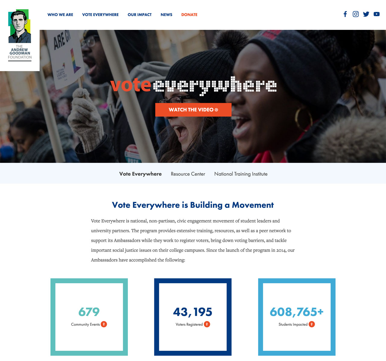
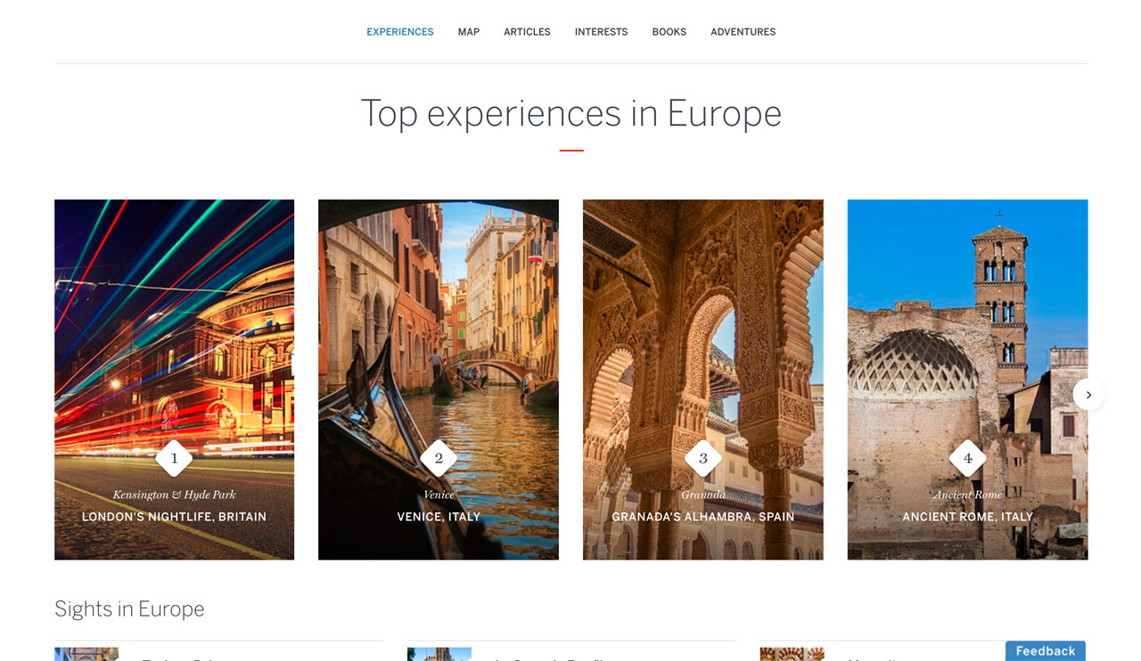
Cards Everywhere
This was another trend we mentioned back in 2015. Cards - or the Pinterest-like content tiles you often see on sites, have proven extremely useful for responsive layouts and content clarity. Their design success means we’ll start seeing these more and more in 2017 - especially in news and social feeds.
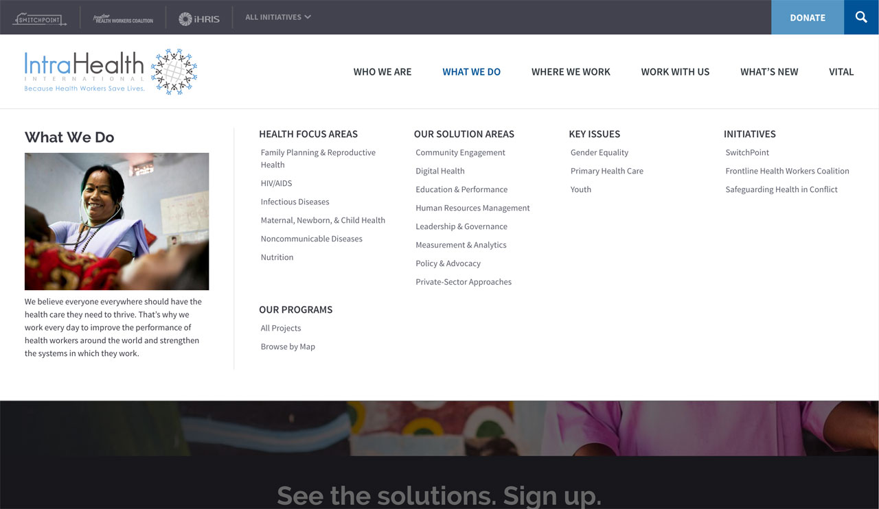
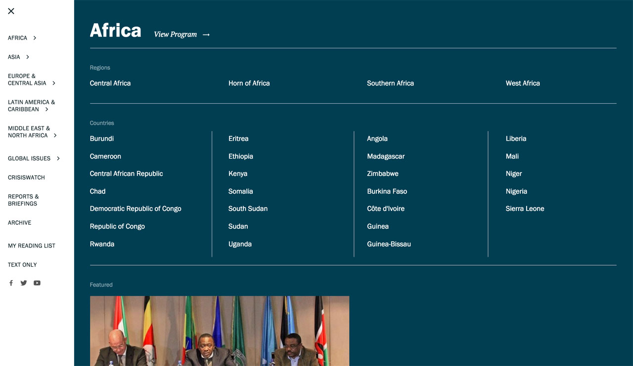
Goodbye overcrowded menus - hello meganavs and immersive navigation
As users grow more intuitive with the web, we’re going to start to see more experimentation and changes in site navigation. This year, we can expect to see menus with fewer top-level items and large, well-designed meganavs that drop down to reveal subpages and even featured content. Additionally, as the hamburger menu becomes more commonplace on desktop, we should start seeing more examples of immersive navigation. This means more sites will have navigation that completely takes over the screen to reveal menu items, and even other content such as blog posts or images.
We are really excited for what web design has in store for 2017. What sort of trends do you see happening this year?
Related Posts

Web Design & Development Trends You'll See in 2015
Comments
kishor Zeabros
What an experienced blogger, Ya! experience comes from excellent knowledge. How beautifully you write in this blog. Great Job!Annexorien
Now it has to be completely changed the website trends.Ricky Shah
Awesome web design trends you have to publish here.I love all.I'm very late but I am so thankful to open your website.Nagarajan Sivanadipatham
Great post. Designers should design for their clients and not for themselves or their portfolio. Also trends die.Webgen
Yeah, really awesome very informative blog post.Cristiano Almeida
This was a very insightful and comprehensive analysis on 2017 web design trends.Good job!
Leave a comment